
How to Read Stock Charts
The secrets of stock charts! Learn how to read stock charts and analyze prices, trends & signals to boost your trading game. Click Chart to zoom.
Common Indicators
Simple Moving Average
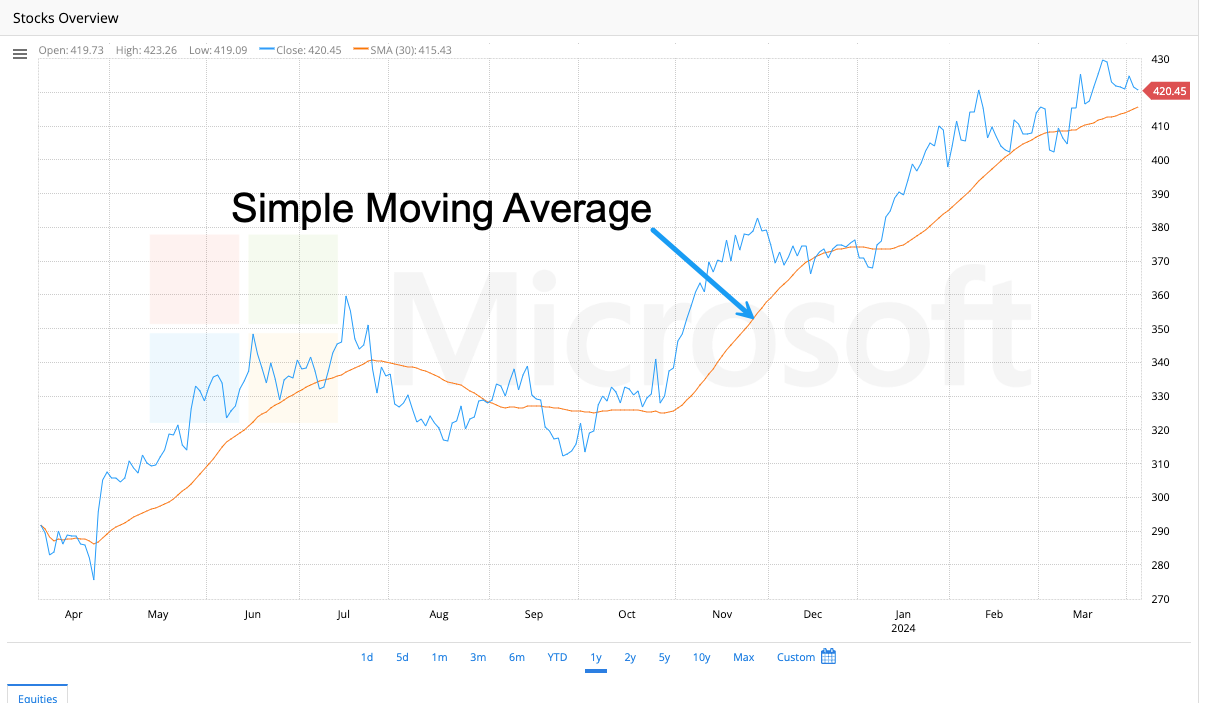
Imagine tracking the daily closing price of a stock. The price can fluctuate, making it harder to see the bigger picture. The simple moving average (SMA) smooths out price data by taking the average closing price over a specified number of days, such as 50 or 200 days.
Here’s how it works:
- Pick several days (lookback period). This is how much history you want to consider.
- Add up the closing prices for those days.
- Divide that sum by the number of days you chose.
Boom! That’s your SMA for that period.
What does the SMA tell you:
- Upward trend: If the SMA is going up, it suggests the price has generally been increasing over that period.
- Downward trend: If the SMA is going down, it suggests the price has generally been decreasing.
- Flat trend: If the SMA is flat, it suggests the price hasn’t been moving much in one direction or another.
Traders use SMAs in a few ways:
- Identify trends: As mentioned above, the direction of the SMA can signal the overall trend.
- Some traders buy when the price crosses above the SMA and sell when the price falls below the SMA. The idea is that prices will continue to climb in the first instance and fall in the latter.
Exponential Moving Average

Think of a Simple Moving Average (SMA) as an average that weighs all price data points the same.
The EMA is similar, but it gives more importance to recent prices. It’s like a moving average that reacts faster to what’s happening now.
The EMA gives more weight to recent closing prices than older prices which have less weight. This makes the EMA more responsive to recent price movements.
Why do traders use EMA?
Since the EMA weighs recent prices more, the EMA can help identify trends quicker than the SMA. This can be helpful for traders who want to make decisions based on the latest market movements.
The EMA line is smoother than the SMA line because it is influenced by past data points but with less weight.
While EMAs can be useful, keep in mind:
Impacted by swings: The EMA reacts to and is sensitive to short-term price swings. As a result, it may not reflect the true trend.
- Not a perfect predictor: The EMA is a tool to help analyze trends, not a guaranteed way to predict future prices.
MACD (Moving Average Convergence Divergence)
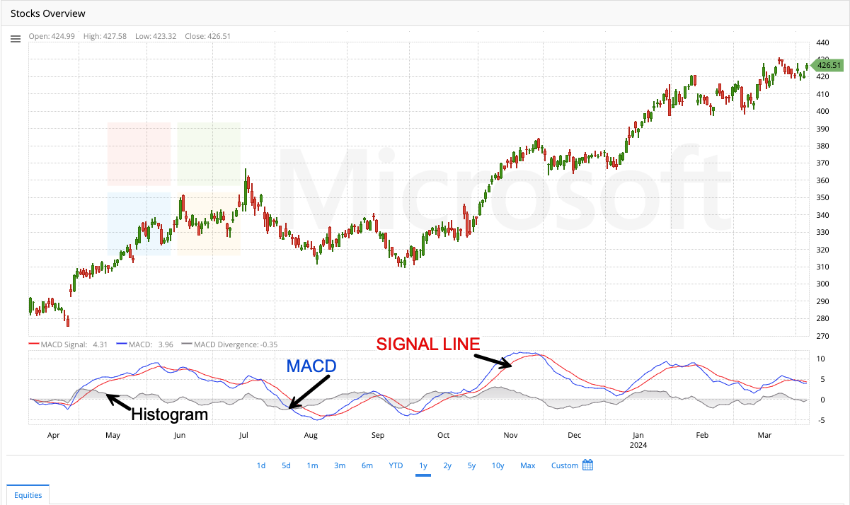
Let’s say you’re following a stock’s price and want to see if it’s gaining or losing momentum. The MACD is a tool that helps with this. It weighs the long-term and short-term averages of the price and shows how they interact.
Here’s a simplified breakdown:
The MACD uses two special moving averages, typically a 12-day and a 26-day EMA.
The MACD line itself shows the difference between these two averages.
Another “signal line,” smooths out the MACD line for easier interpretation.
What can the MACD tell you?
Trend direction: The general direction of the MACD line indicates the trend. An upward trend for bullish, and downward for bearish.
- Momentum:
The wider the gap between the MACD line and the signal line, the stronger the trend momentum.
- Potential buy/sell signals: There are various ways to interpret the MACD for trading signals, with some common ones being:
- Crossovers: When the MACD line crosses above the signal line, it may indicate a potential buying opportunity, and vice versa for a sell signal.
- Divergence: At times, the price movement may deviate from the MACD, indicating a potential shift in the trend.
Keep in mind:
- The MACD is a tool to help analyze trends, not a guaranteed way to predict future prices.
- Before making trading decisions, it’s important to consider other factors when interpreting MACD signals.
Relative Strength Index
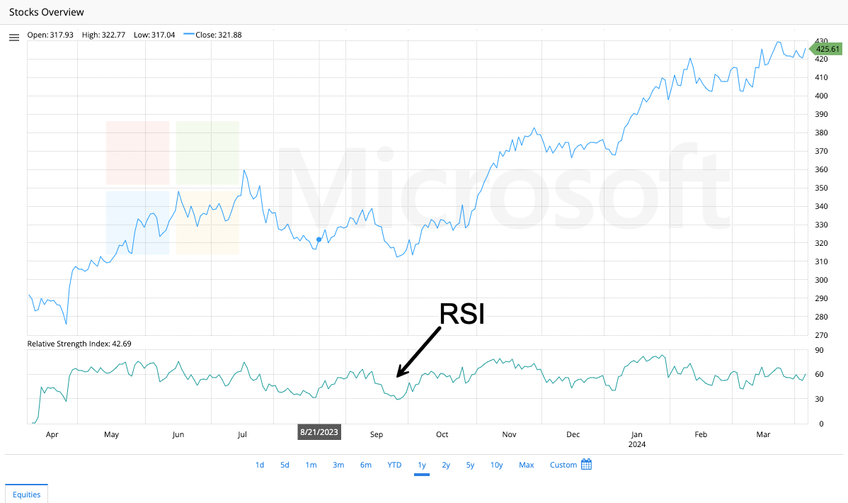
You’re watching a stock price and want to know if it’s due for a rise or fall. The RSI is a tool that helps with this by gauging how strong recent price movements have been. It considers how much the price has moved and how quickly those changes happened.
Here’s the basic idea:
- The RSI gives a score between 0 and 100.
- Generally, a score above 70 suggests the price might be overbought (meaning it may have risen quickly and could be due for a correction).
- A score below 30 suggests the price might be oversold (meaning it may have fallen too quickly and could be due for a rebound).
What can the RSI tell you?
- Overbought/oversold conditions: The RSI can’t predict the future, but extreme high or low readings suggest the price might be due for a move in the opposite direction.
- Momentum: The speed of recent price changes is factored into the RSI. A rapidly rising RSI might suggest strong buying pressure, while a rapidly falling RSI might suggest strong selling pressure.
Bollinger Bands
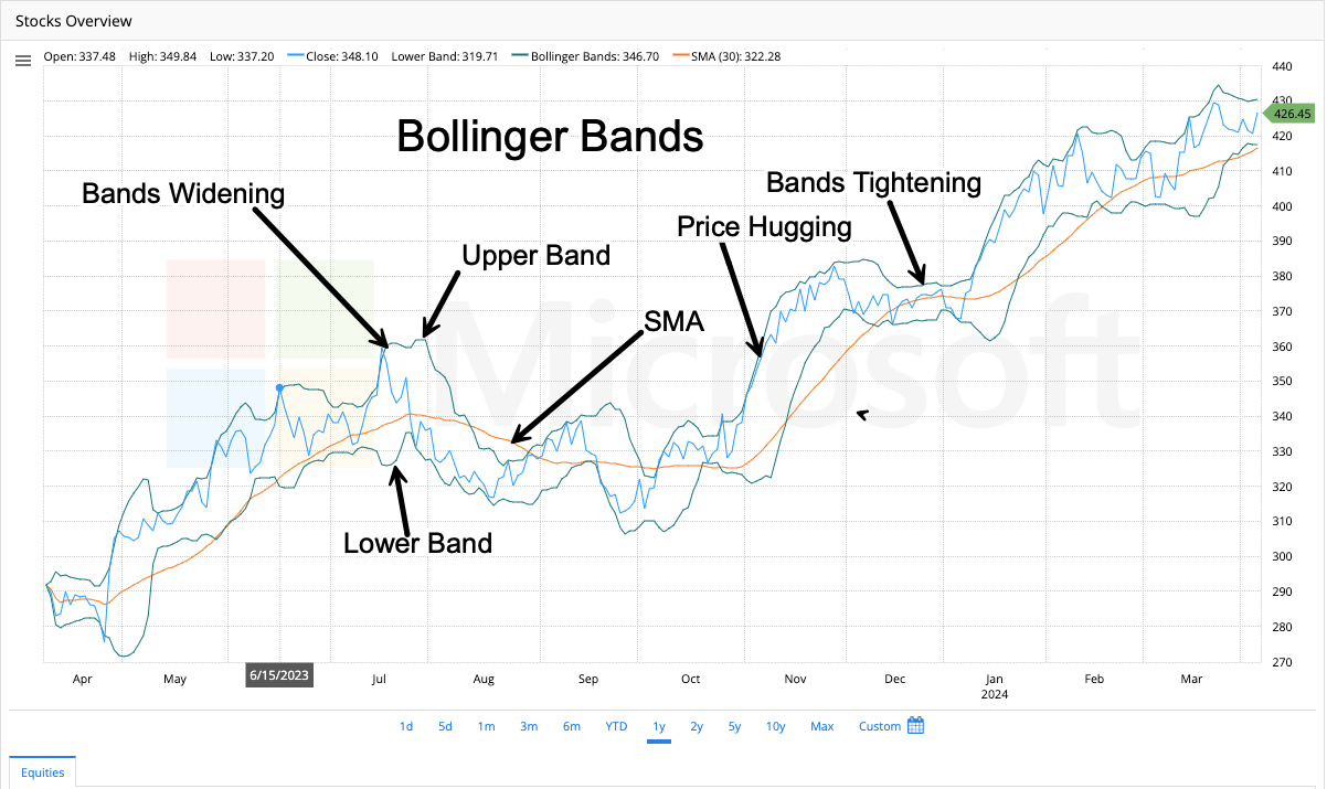
Bollinger Bands is a popular technical analysis tool that helps visualize the price movements and volatility of a stock. Here’s a breakdown to understand their usage on stock charts:
Components:
- Moving Average (MA): The center line represents a simple moving average (SMA) of the price over a chosen period (e.g., 20 days). This smooths out price fluctuations and reflects the stock’s general trend.
- Upper and Lower Bands: These lines are plotted two standard deviations above and below the moving average. Standard deviation is a statistical measure of price dispersion around the average. So, the bands act like envelopes that widen as prices become more volatile and contract during calmer periods.
Formula:
- Upper Band: MA + (Number of Standard Deviations) x Standard Deviation
- Lower Band: MA – (Number of Standard Deviations) x Standard Deviation
Interpretation:
Bollinger Bands offer insights based on the price’s relationship to the bands:
- Price near the Upper Band: This suggests a potential overbought condition, where the price may be inflated and due for a correction (price dip).
- Price near the Lower Band: This indicates a possible oversold scenario, where the price may be undervalued and ripe for a rebound.
Important Points:
- Bollinger Bands are relative indicators. A price touching the upper band might not always signal an overbought condition, especially if it’s steadily trending upwards. Similarly, a touch of the lower band doesn’t guarantee an oversold situation.
- Band Width: The distance between the upper and lower bands reflects volatility. Expanding bands suggest increasing volatility while contracting bands indicate lower volatility.
- Breakouts: Sharp price movements that break above the upper band or below the lower band can signal potential continuations of the trend in that direction. However, false breakouts can also occur.
Combining Bollinger Bands with Other Indicators:
Bollinger Bands are more effective when used with other technical indicators like RSI (Relative Strength Index) or MACD (Moving Average Convergence Divergence) to confirm trading signals.
By understanding these aspects, Bollinger Bands can be a valuable tool for traders to gauge market sentiment, identify potential entry and exit points, and manage risk during their stock chart analysis.
On Balance Volume (OBV)

You’re looking at a stock chart and you want to understand buying and selling pressure. The OBV is a tool that can help with this. It tracks the volume (number of shares traded) each day and considers whether the price went up or down from the previous day.
Here are the key ideas:
- If the price closes higher than the previous day, the OBV adds that day’s volume to a running total. This suggests possible buying pressure.
- When the closing price of a stock decreases, the On-Balance Volume (OBV) subtracts that day’s trading volume from the total volume. This helps in analyzing the buying and selling pressure in the market.
What can the OBV tell you?
- Buying vs. selling pressure: By analyzing the OBV line trend, you can determine if more buying or selling in the market.
- Potential trend direction: A rising OBV might suggest a buildup of buying pressure, potentially foreshadowing a price increase (bullish trend). Conversely, a falling OBV might suggest selling pressure, potentially foreshadowing a price decrease (bearish trend).
Remember:
- The OBV isn’t a perfect predictor of future prices. There can be other factors influencing price movements.
- The OBV is most helpful when used alongside other technical indicators on the stock chart.
Stochastics
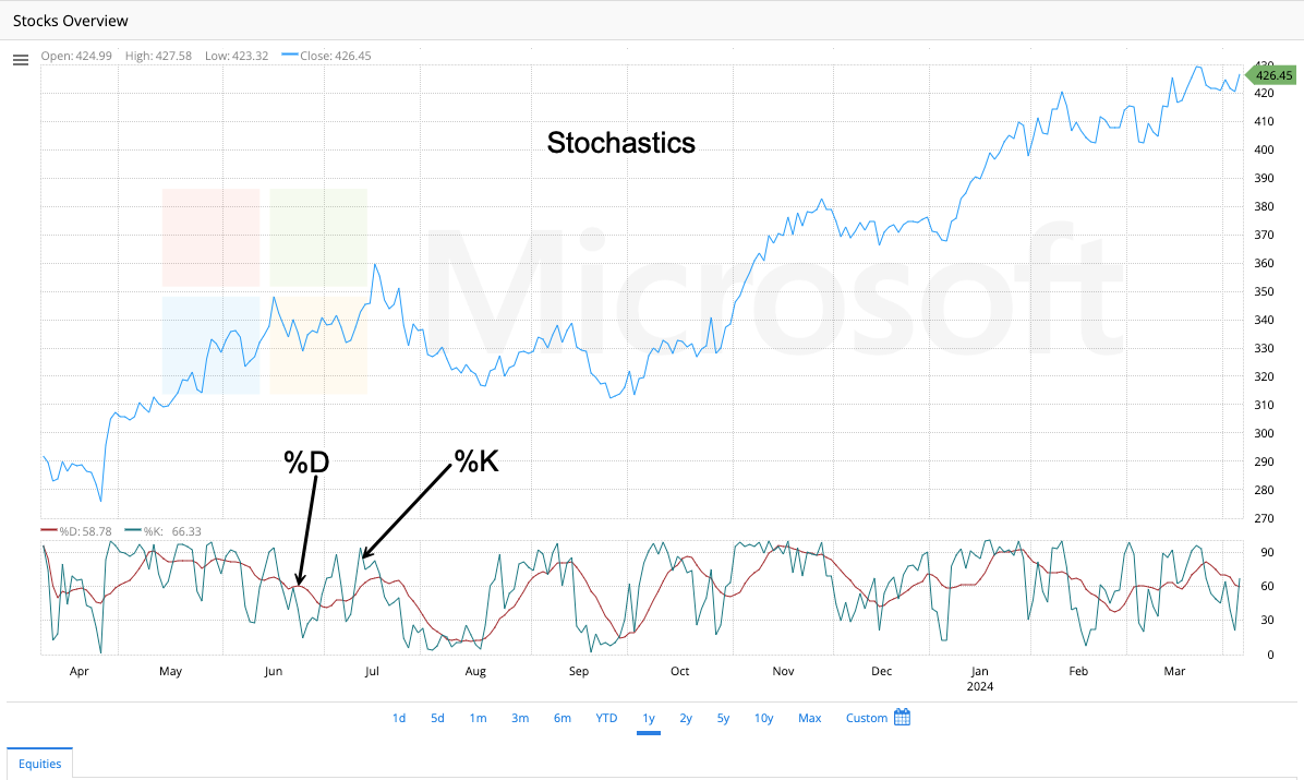
The Stochastic Oscillator is a tool used on stock charts to help identify potential buying and selling opportunities. It considers two things:
- The recent closing price of a security.
- The price range of that security over a chosen period (like 14 days).
Imagine the price range as a high-low “box” for the security over that period. The Stochastic Oscillator shows where the closing price falls within that box.
- High closing prices relative to the range will give a higher Stochastic reading (often above 70). This suggests the security might be overbought.
- Low closing prices relative to the range will give a lower Stochastic reading (often below 30). This suggests the security might be oversold.
Additional points to consider:
- The Stochastic Oscillator can be volatile, so a moving average is often used to smooth it out.
- The indicator itself doesn’t predict future prices, but the overbought/oversold zones can suggest potential reversals in the trend.
TRIX (Triple Exponential Average)
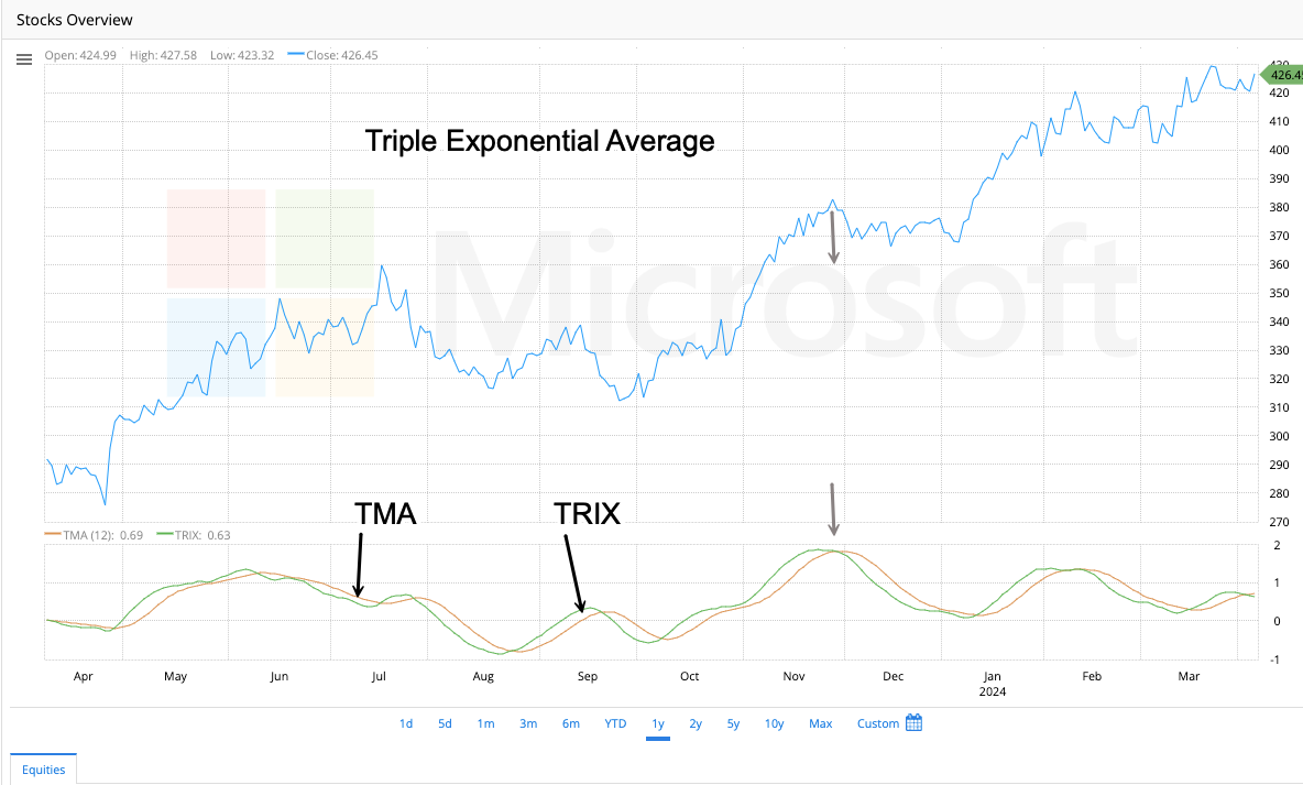
TRIX is a tool on stock charts that helps spot trends and potential buying/selling opportunities. It does this by looking at price movements and filtering out minor ups and downs that might be misleading.
Here’s a simplified breakdown:
- Think of a regular moving average that smooths out price data. TRIX takes it further by smoothing the moving average a few extra times to focus on the bigger picture.
- By filtering out short-term noise, TRIX can help identify stronger trends, whether up or down.
- Similar to other indicators, TRIX can sometimes generate buy/sell signals based on their direction and crossover with another line (called a signal line).
Remember:
- TRIX is a tool for analysis and not a guaranteed predictor of future prices.
- It is commonly used with other technical indicators to provide a more comprehensive perspective.
Chaikin’s Volatility
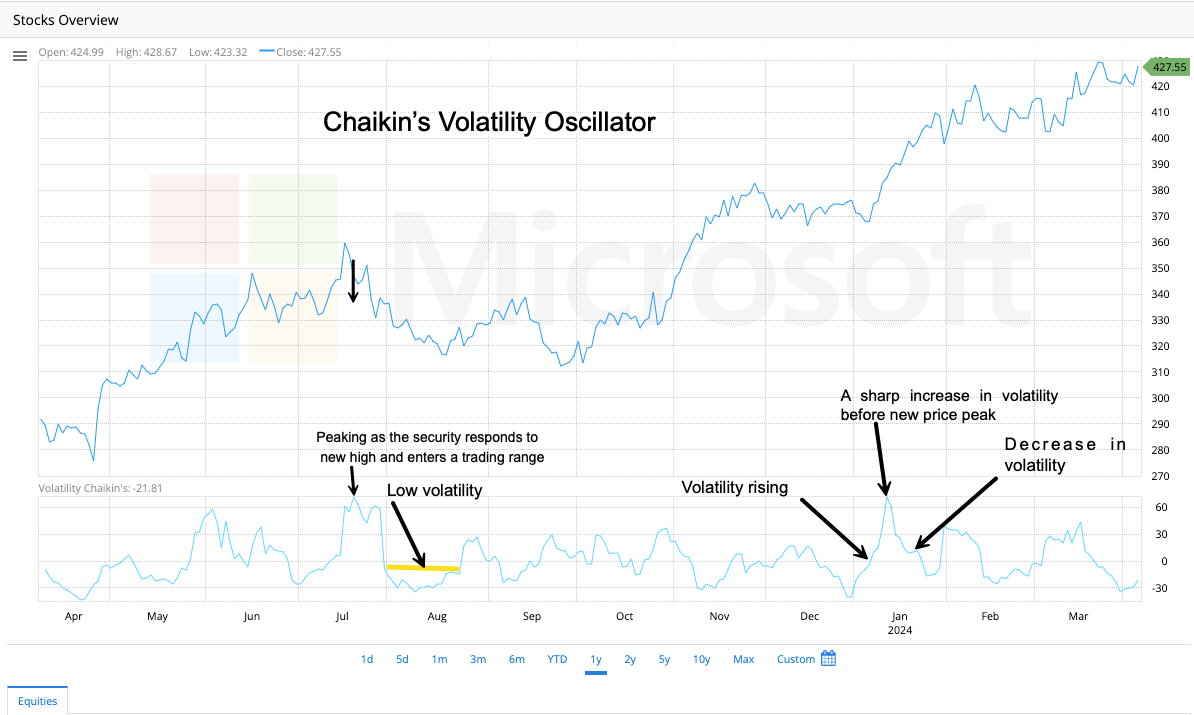
This indicator is named after Marc Chaikin, a well-known stock analyst who developed various tools to help investors analyze markets.
You’re tracking a stock’s price and want to understand how much it’s swinging up and down. The Chaikin Volatility indicator is a tool that helps with this. It calculates the difference between the highest and lowest prices of a security within a chosen time frame, such as 20 days.
The key idea is :
- A high Chaikin Volatility reading means the price has been moving up and down a lot within that period, suggesting high volatility.
- A low Chaikin Volatility reading means the price hasn’t been swinging much, suggesting lower volatility.
What can Chaikin Volatility tell you?
- Market Stability: It can help gauge how stable or volatile the price movements are for a security.
- Potential Turning Points: Sometimes, sharp increases in volatility can precede market tops or bottoms, it can be a clue for potential trend reversals.
Price Overlays
Envelopes
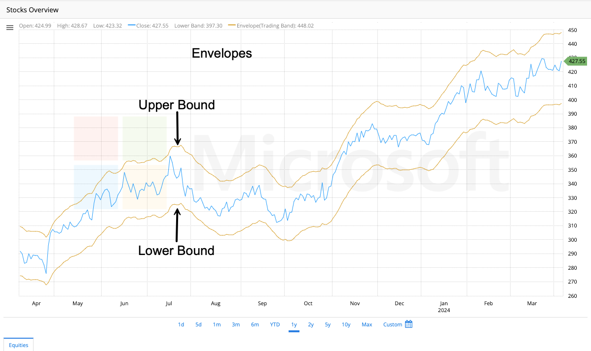
Envelopes: Gauging Price Stretch
Have you ever felt like a stock’s price has stretched too thin or inflated too quickly? Envelopes, a technical analysis tool, can help you visualize this. Imagine them as flexible bands wrapped around the price line on a stock chart.
How Envelopes Work:
Envelopes are created using two moving averages, one plotted above the price and one below. The distance between these lines and the price line is typically set as a percentage of the average price movement. This creates a dynamic channel that expands and contracts as price volatility fluctuates.
What Envelopes Can Tell You:
Overbought/Oversold Signals:
When the price shoots up and touches the upper envelope, it might be a sign the market considers it overbought. This suggests the price might be due for a correction. Conversely, if the price plunges and touches the lower envelope, it might be nearing oversold territory, potentially indicating a buying opportunity.
Envelopes: A Cautionary Tool
While envelopes help identify potential overbought/oversold conditions, it’s important to remember they are not crystal balls. A price touching an envelope doesn’t guarantee a guaranteed reversal. It’s always wise to use envelopes with other technical indicators and consider broader market factors before you make any trading decisions.
Median Price
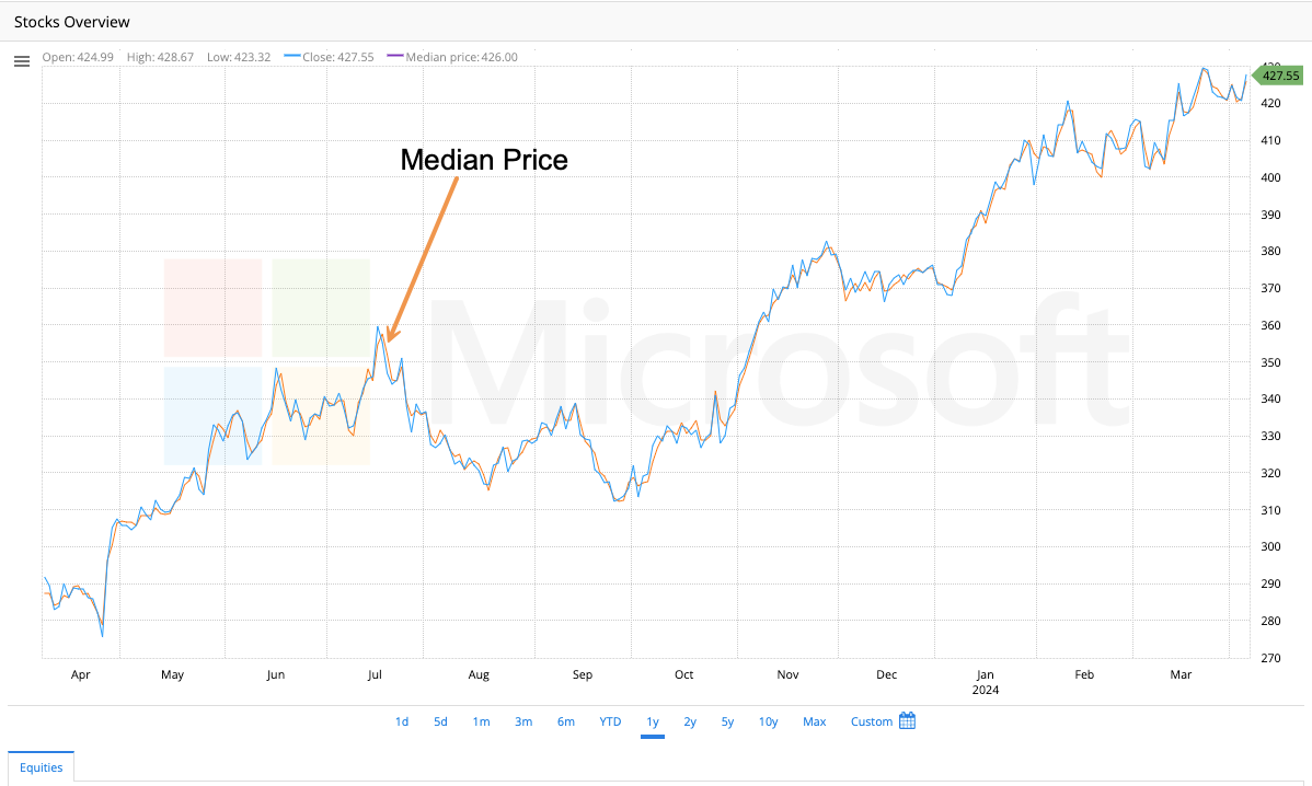
The median price of a security within a given time frame is the price that lies exactly in the middle when all the prices are sorted in order from lowest to highest. If an odd number of prices are recorded, the median price is the price in the middle. If an even number of prices are recorded, it is the average of the two middle prices. For example, if the recorded prices are $15, $17, or $20, the median price would be $17. The median price is less influenced by extreme price movements (very high or low trades) when compared to the closing price.
Triangular MA (Triangular Moving Average)

Have you ever looked at a stock chart with squiggly lines and wished it were smoother? The TMA can help with that! It’s a special type of moving average that smooths out price fluctuations even more than a regular moving average.
Here’s the key idea:
- Imagine a regular moving average that takes the average price over a certain number of days. The TMA takes that a step further by averaging the moving average itself! This double-smoothing helps reduce short-term ups and downs.
- Because it’s smoother, the TMA is often used to identify long-term trends in the market, whether prices are generally going up or down.
Benefits of using the TMA:
- Clearer Trend Lines: The smoother line of the TMA can make it easier to spot long-term trends compared to a regular moving average.
- Less Noise: The TMA (Triple Moving Average) is a technical indicator that smooths out short-term price fluctuations and focuses on the larger trend of price movements. This helps traders to get a clearer picture of the overall market direction.
Keep in mind:
- The TMA reacts slower to price changes because of the double-smoothing.
- It’s a tool to help analyze trends, not a guaranteed way to predict future prices.
Typical Price
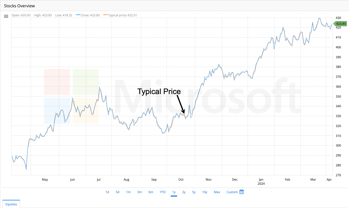
The typical price is calculated as the sum of the high, low, and close prices divided by three. It is a simple way to get a general sense of a security’s price movement within a specific timeframe (like a day). The typical price offers a quick snapshot, whereas moving averages take more data points into account.
Weighted Close
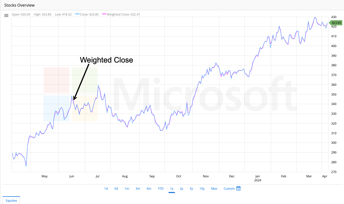
Let’s say you’re tracking a stock’s price throughout the day and the closing price is important, but it doesn’t tell the whole story. The weighted close considers the high, low, and closing prices, but gives the closing price more weight.
Here’s the basic idea:
- It’s like a simple average of the high, low, and closing prices, but the closing price counts a little more.
- This gives a more balanced view of the price action for that day compared to just using the closing price alone.
Why use the weighted close?
- More representative price: The weighted close provides a more accurate view of the day’s overall price activity.
- Basis for other indicators: Some technical analysis tools use the weighted close as a starting point for their calculations.
Keep in mind:
- The weighted close is a simple way to analyze price movements and not a foolproof method for predicting future prices.
Weighted Moving Average
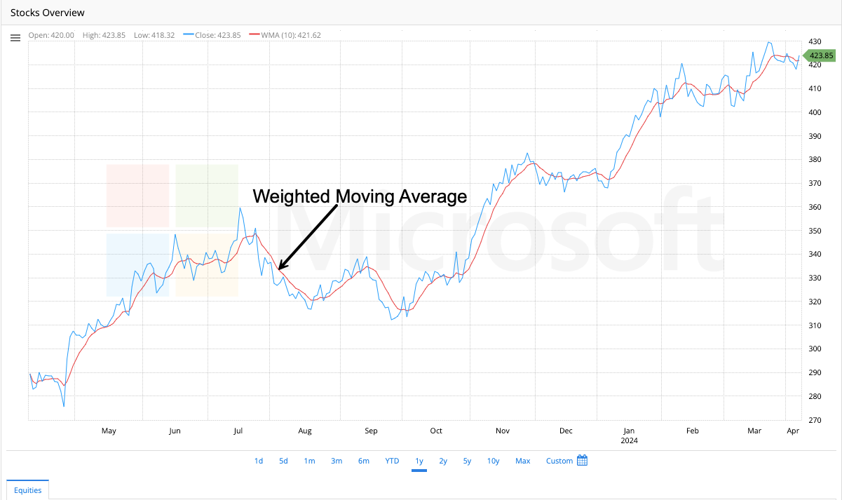
The Weighted Moving Average is an average that allocates varying weights to each data point within a specified window. In contrast to the Simple Moving Average (SMA) which gives equal importance to all values, the WMA weighs more on recent prices and decreases the weightage for older prices in the considered period.
Traders often use WMA because it accurately reflects recent market activity. It is commonly used alongside other technical indicators to identify market trends and potential reversal points. Its focus on recent prices means that the WMA follows the price activity more closely than a Simple Moving Average.
Technical Indicators
Avg. True Range (Average True Range)
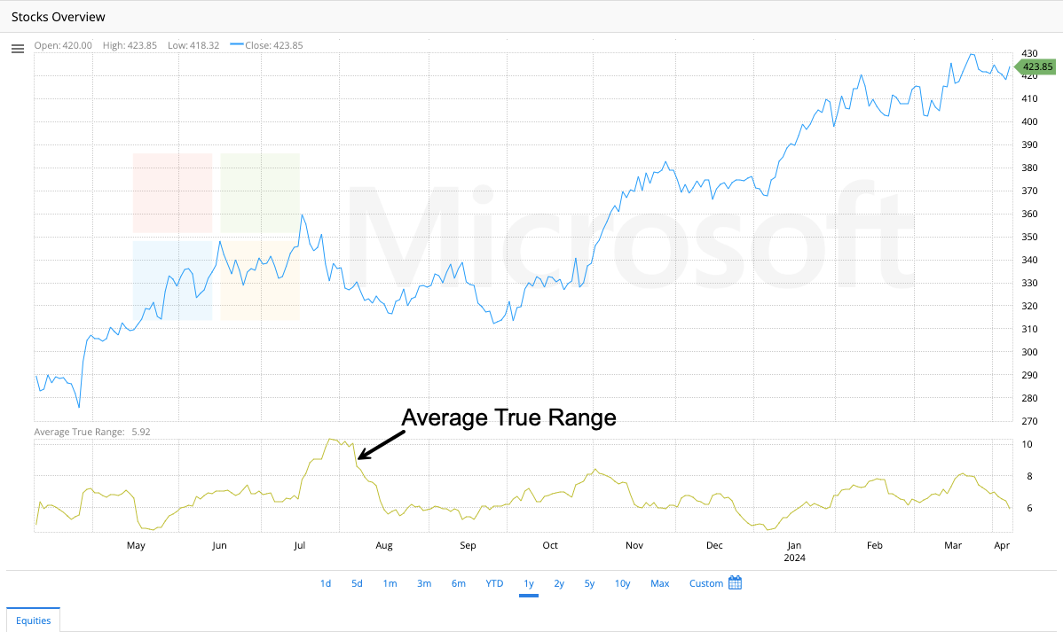
ATR is an indicator that measures market volatility by decomposing the entire range of an asset price for that period. It measures the volatility caused by gaps and limits up or down moves.
Commodity Channel Index
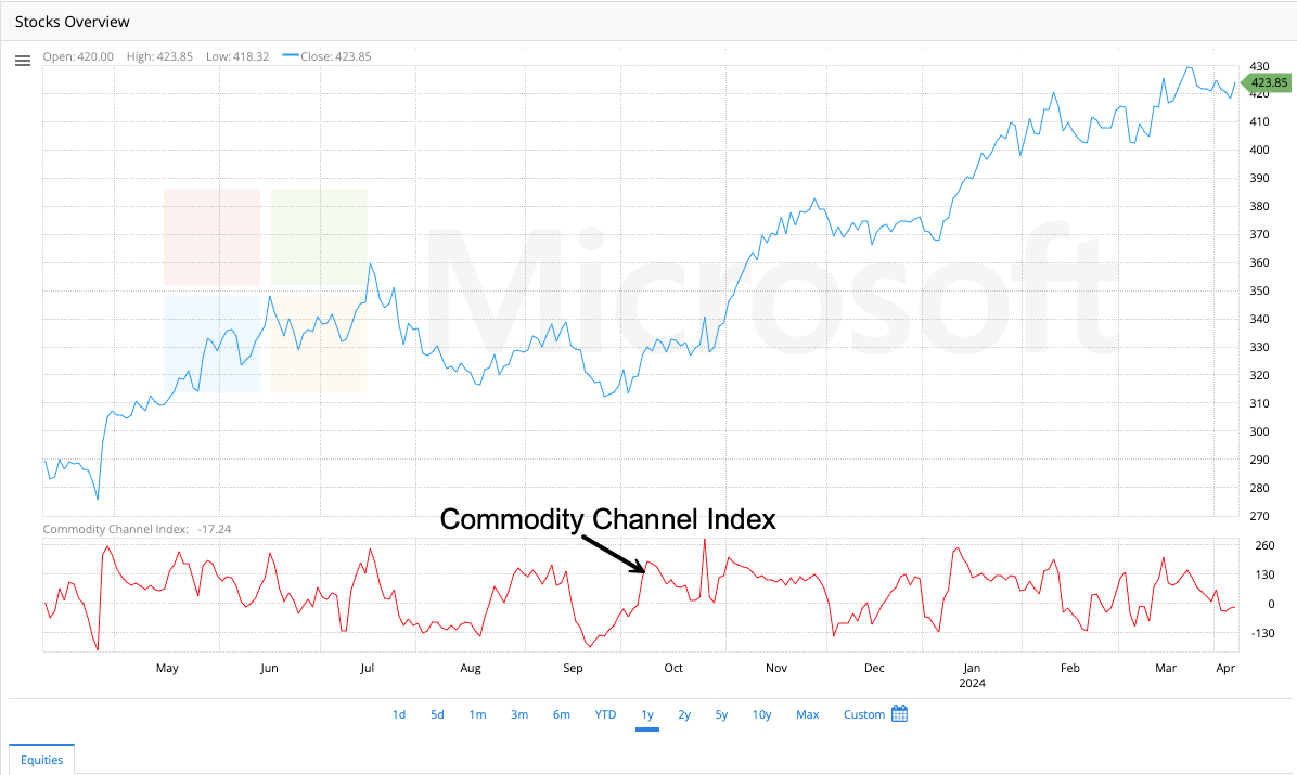
CCI is an oscillator often used in technical analysis to identify when a security has been overbought or oversold. It compares the current price with an average price over a given period and can signal divergences from typical price movements.
Detrended Price Oscillator (DPO)

The DPO is a technical indicator used to identify short-term cycles and overbought/oversold conditions by eliminating the influence of long-term trends from a time series.
Mass Index
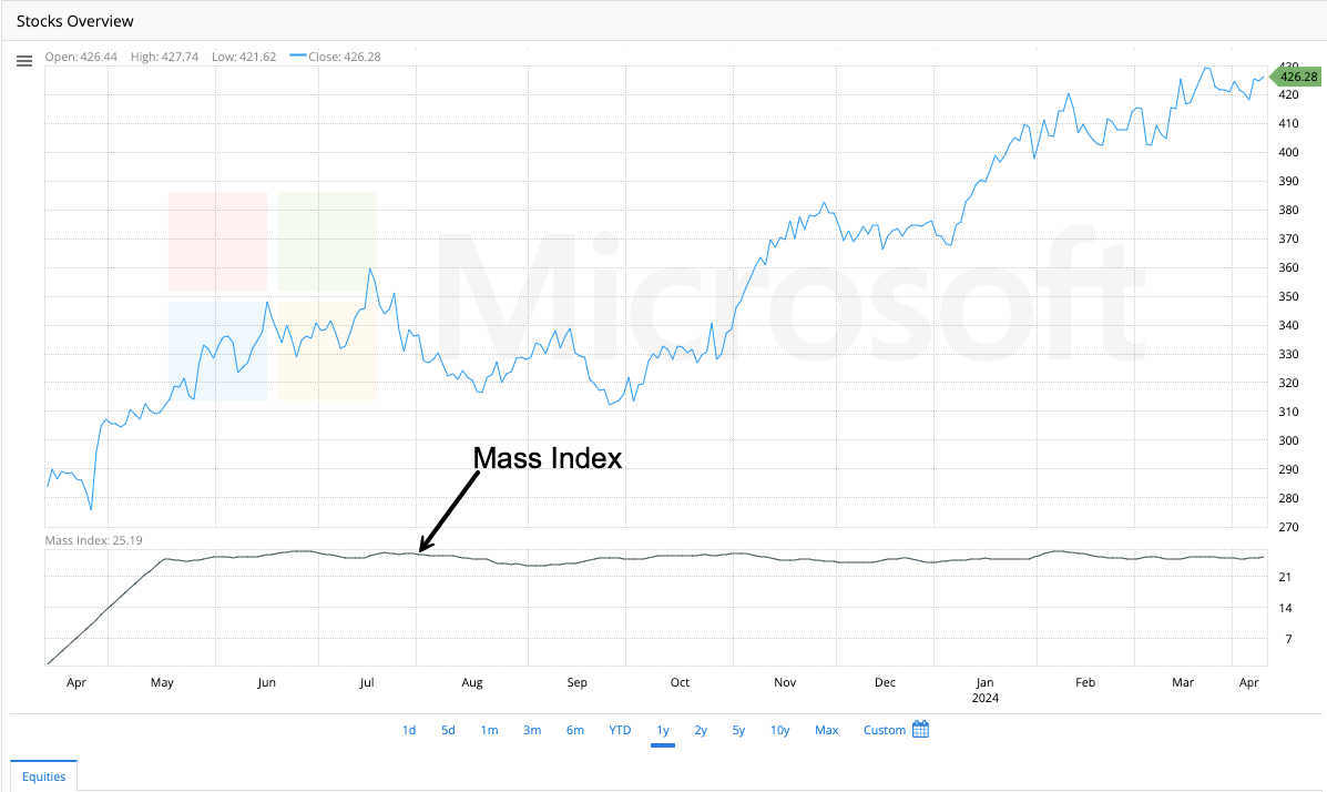
The Mass Index is a market indicator that helps to identify potential price reversals by analyzing the range between high and low stock prices. When the Mass Index rises above a certain level and then falls below that level, this results in a reversal bulge.
Momentum

Momentum is a vector that measures price changes’ speed or velocity in a security, often used to spot potential reversals, indicating when a security is overbought or oversold.
Percent Range of Change
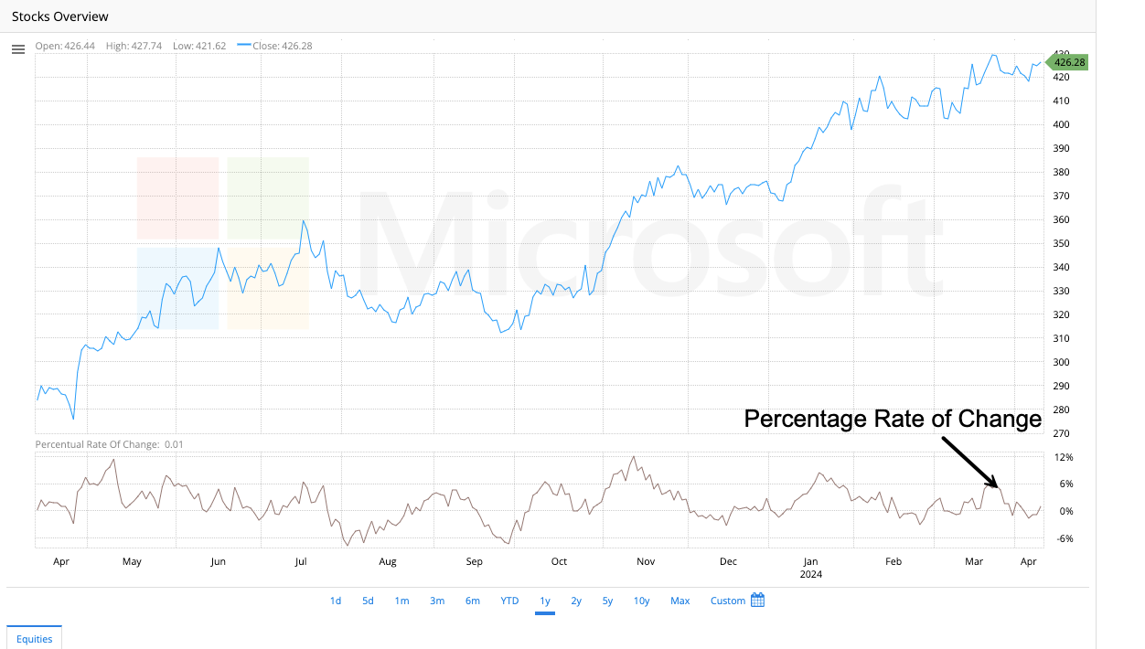
This indicator gauges the pace of price movements by comparing the range between subsequent closing prices. It is often leveraged to identify overbought or oversold conditions in a security’s price.
Performance
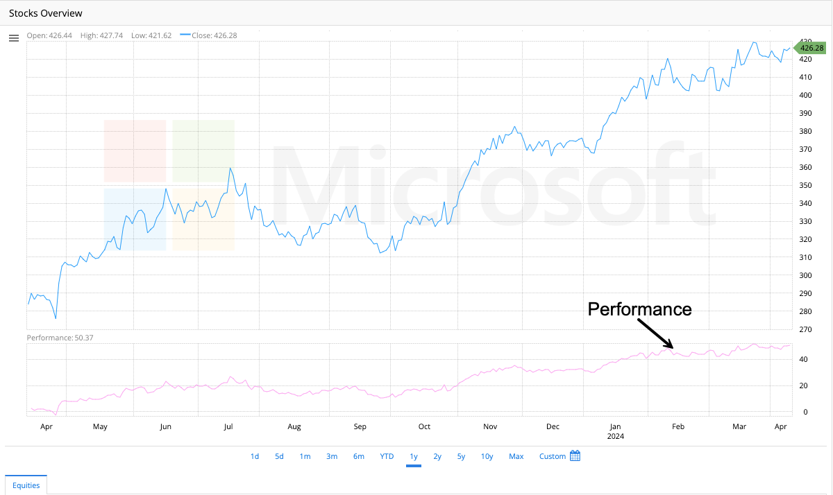
Performance is the percentage measure of price change in a security over time. It is often used to compare securities with each other or with a benchmark.
Vertical Horizontal Filter (VHF)
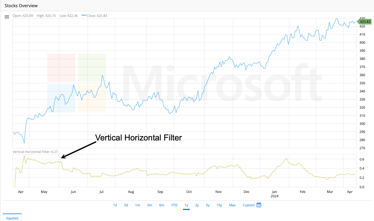
The VHF indicator distinguishes between trending and choppy markets, helping traders apply appropriate strategies.
William %R (Williams Percent Range)
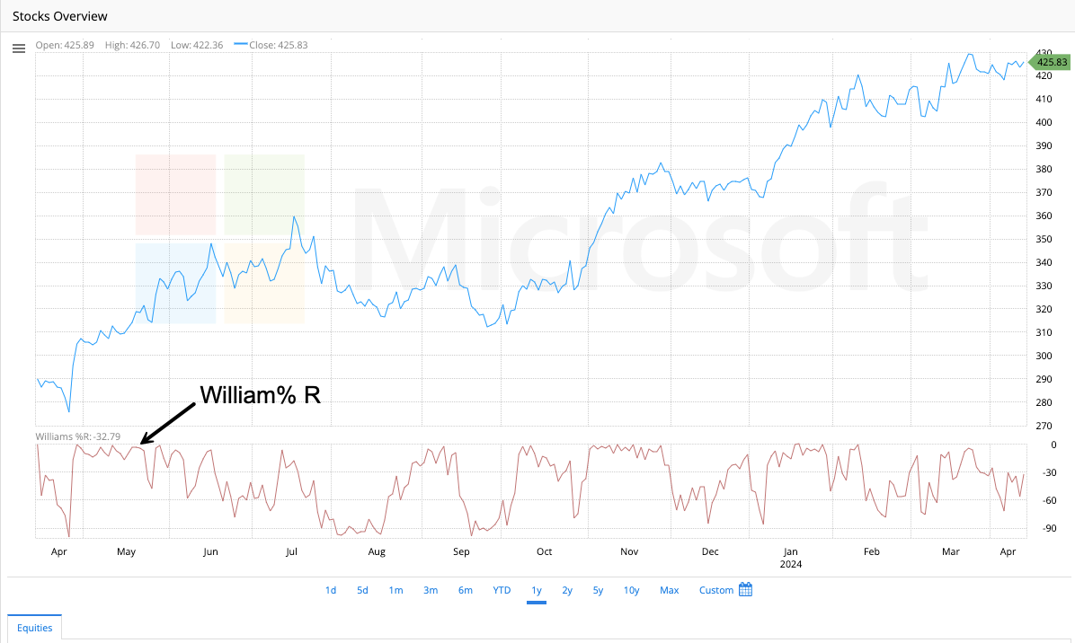
Williams %R is a momentum indicator similar to a stochastic oscillator. It helps to identify overbought and oversold levels in the market. The indicator’s values range from -100 to 0, with readings between -80 and -100 indicating an oversold market and values between -20 and 0 indicating an overbought market. It is commonly used to determine entry and exit points in the market.
Accumulation/Distribution Line

This indicator measures the cumulative money flow in and out of a security. It confirms trends and warns of weak movements that may cause price reversal.
Chaikin Oscillator
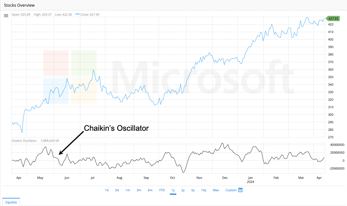
Developed by Marc Chaikin, this oscillator measures the momentum of the Accumulation/Distribution Line using the MACD formula. The crossing of the oscillator over its zero line can be used as a trading signal, similar to the MACD.
Ease of Movement

This indicator evaluates how easily a stock is bought or sold by analyzing its price movement and volume. If the indicator displays large positive or negative values, it indicates that the stock price is moving with little resistance in either direction.
Money Flow Index (MFI)

MFI is a volume-weighted RSI that combines price and volume to identify overbought or oversold conditions in a security. It is used to generate potential buy or sell signals based on divergences in price.
Negative Volume Index (NVI)

The NVI (Negative Volume Index) is an indicator that focuses on days when the trading volume has decreased from the previous day. The theory behind NVI is that ‘smart money’ investors tend to trade during low volumes. Therefore, the NVI can signal bullish or bearish trends and may be useful in identifying potential entry or exit points in the market.
Positive Volume Index (PVI)
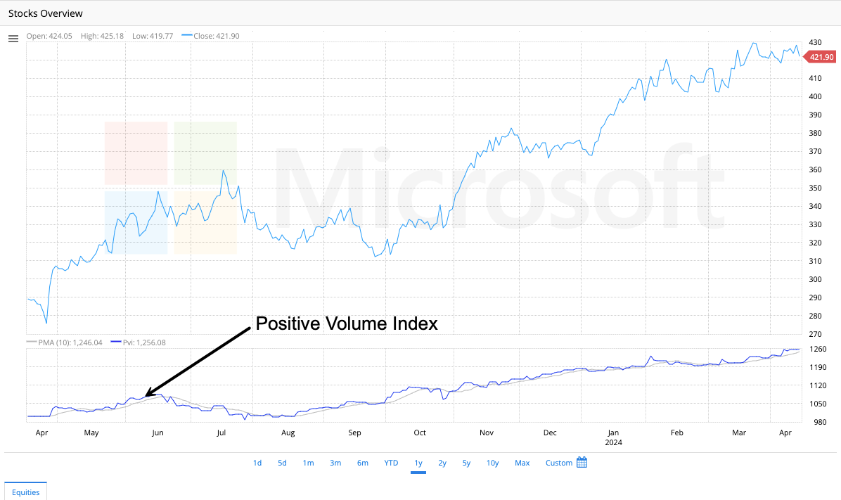
PVI tracks days with increased volume, as uninformed traders usually trade on high-volume days.
Price and Volume Trend (PVT)
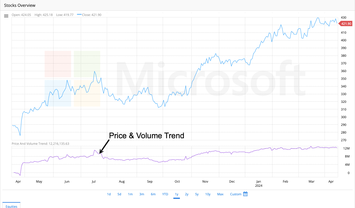
PVT stands for Price Volume Trend, a line that tracks the cumulative percentage changes in share price trends and current volume. The direction of the price trend determines whether the line adds or subtracts a multiple of the percent change. This indicator is useful for assessing the strength of price movements and can signal bullish or bearish trends in the market.
Volume
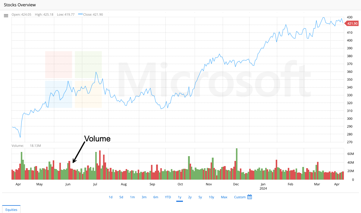
Volume refers to the overall number of securities traded within a specific period. It is a useful metric to gauge the strength or weakness of a price trend. High volume can indicate a strong interest in a price move, while low volume may suggest a lack of interest.
Volume Oscillator
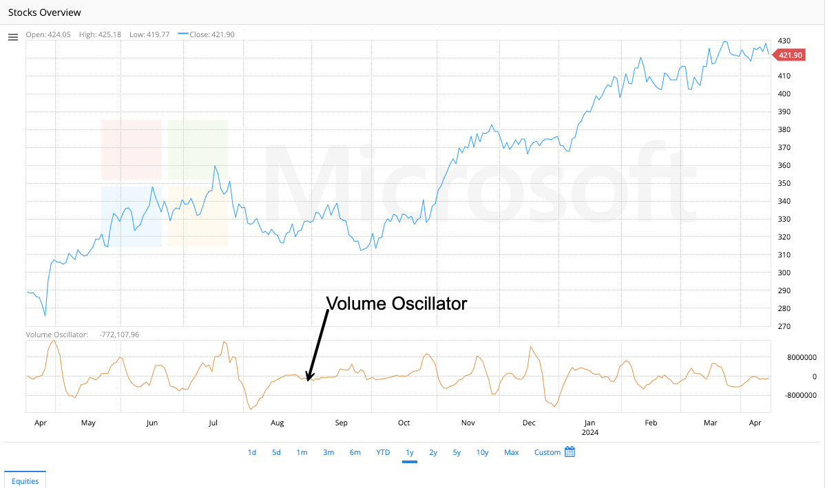
The Volume Oscillator measures the difference between two volume-based moving averages. It is used to predict future volume trends and potential reversals.
Interactive Analysis
Interactive analysis is a contemporary method of technical analysis that permits traders to interact with their data through dynamic charts and live data feeds. Trading platforms that utilize technical indicators in real-time and allow traders to simulate different scenarios are advantageous to traders as they stay well-informed and can make more responsive decisions.
Fibonacci Fan
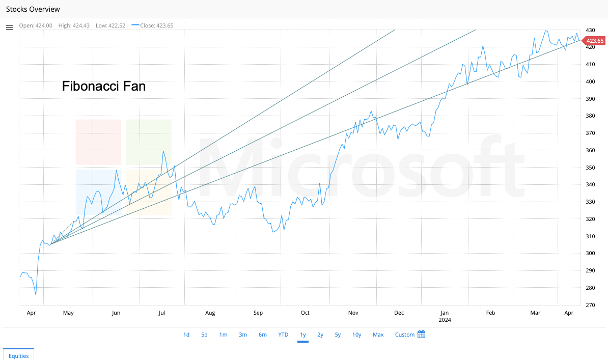
Fibonacci Fan is a technical analysis tool used in finance, specifically in the analysis of stock prices. It is based on the Fibonacci sequence and uses horizontal lines to indicate areas of support or resistance at the key Fibonacci levels before they continue in the original direction. The fan is created by drawing a trend line between two extreme points, usually the low and high prices, and dividing the vertical distance by the key Fibonacci ratios of 23.6%, 38.2%, 50%, 61.8%, and 100%. These ratios then generate the fan lines that extend from the second extreme point. The Fibonacci Fan identifies potential levels of support, or resistance and determines the trend validity.
Fibonacci Arcs
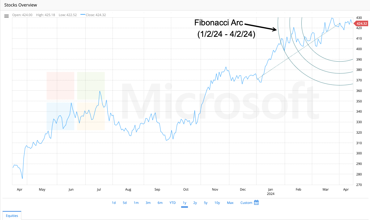
Fibonacci Arcs are a technical analysis tool used to identify the level of potential support and resistance on a price chart. These arcs are drawn between two points on a chart based on Fibonacci ratios (23.6%, 38.2%, 50%, 61.8%, and 100%). The arc levels are determined by ratios that divide the distance between two points. Traders use these levels to identify potential areas where the price of an asset may encounter support or resistance.
- Fibonacci Fans versus Fibonacci Arcs
Fibonacci Fans and Fibonacci Arcs are technical analysis tools that predict support and resistance in financial markets.
The main difference between Fibonacci Fans and Fibonacci Arcs is the method used to draw them. Fans are drawn using trend lines, while Arcs are drawn using circles.
Another difference is that Fibonacci Fans are used to identify potential areas of support and resistance at different angles, conversely, Fibonacci Arcs are used to identify potential areas of support and resistance based on the distance from the center point of the circle.
Despite these differences, both tools are based on the Fibonacci sequence and use the same ratios to identify potential areas of support and resistance. Both tools help to identify key levels in a market and to make informed trading decisions.
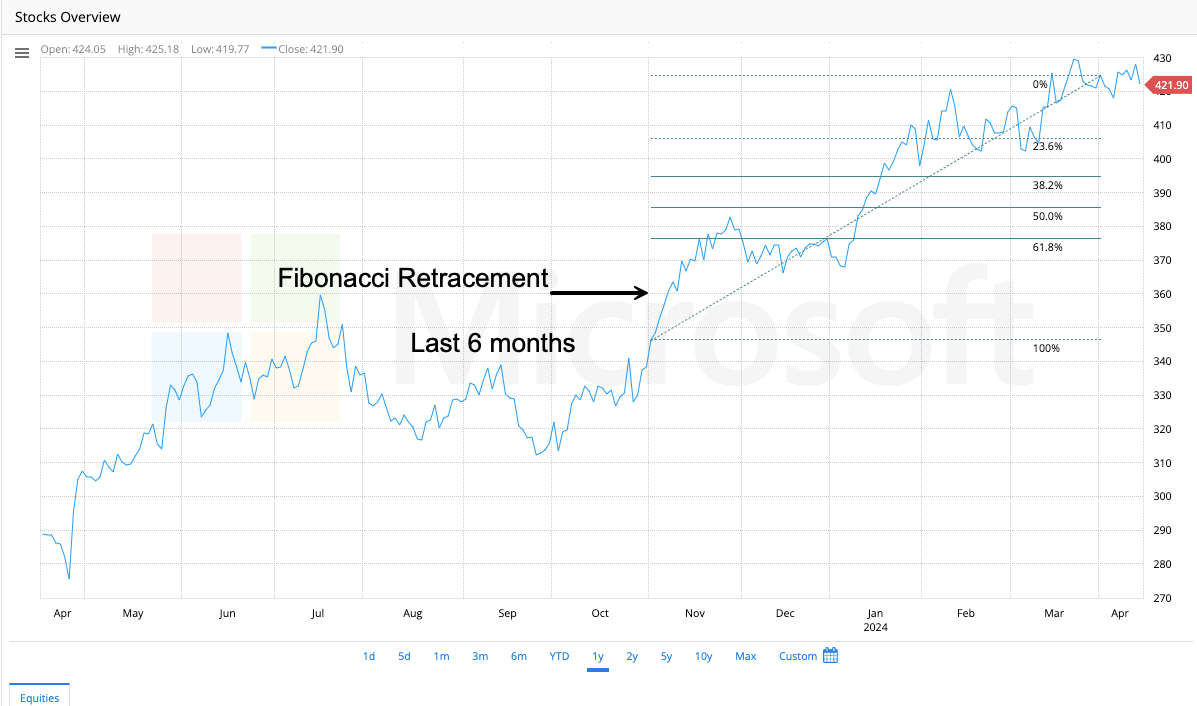
Fibonacci Retracement
Fibonacci TimeZones
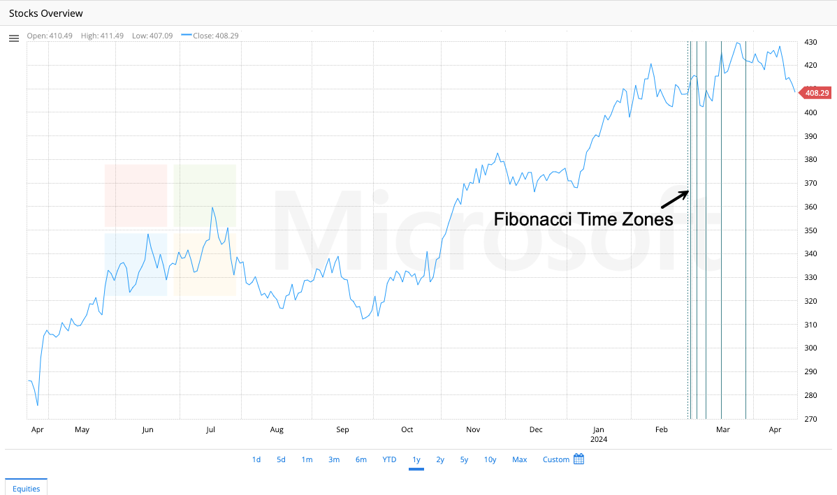
Fibonacci Time Zones Explained
You’re looking at a stock chart and notice a significant swing (a sharp rise or fall in price). Fibonacci Time Zones help you to identify potential future turning points in the price movement based on the Fibonacci sequence.
Here’s the key idea:
- The Fibonacci sequence is a series of numbers (1, 1, 2, 3, 5, 8, 13, etc.) where each number is the sum of the two preceding numbers.
- Fibonacci Time Zones use these ratios (23.6%, 38.2%, 50%) to mark vertical lines on the chart at specific time intervals after the swing high or low.
What can Fibonacci Time Zones tell you?
- Potential turning points: The vertical lines represent areas where the price might encounter resistance (on an uptrend) or support (on a downtrend). These zones might indicate potential price reversals or pauses in the trend.
Remember:
- Fibonacci Time Zones are not guarantees, just possibilities. The price might not necessarily reverse at these exact points.
- They are most effective when used with other technical indicators for confirmation.
Additional Tips:
- The zones closer to the initial swing point (like 38.2% or 50%) are generally considered stronger potential reversal areas compared to zones further out.
- You can use Fibonacci Time Zones on different timeframes (daily or weekly charts) to identify potential turning points on various time horizons.
Gann Fan

The Gann Fan, named after W.D. Gann, is a technical analysis tool traders use to identify potential support and resistance levels in the market. It works by drawing a series of diagonal lines, like a fan, on a price chart.
How it Works:
- Geometric Angles: Each line, called a Gann angle, is drawn at a specific angle based on mathematical ratios between price and time. Common angles include 1:1 (45 degrees), 1:2 (26.6 degrees), and 2:1 (63.4 degrees).
- Support and Resistance Zones: These lines are thought to act as zones where the price might bounce or reverse. If the price reaches a Gann fan line during a rise, it may indicate resistance and a potential pullback. Conversely, if the price is falling and approaches a line, it could indicate support and a potential price increase.
Important Considerations:
- Subjectivity: The Gann Fan is based on patterns, but it’s still subjective. There’s no guarantee the price will hit the predicted zones.
- Confirmation: Even if the price touches a Gann fan line, it doesn’t guarantee a reversal. Look for confirmation from other technical indicators or price action patterns before making trading decisions.
- Combined Analysis: The Gann Fan is often used alongside other technical analysis tools like trendlines or moving averages for a more well-rounded trading strategy.
Benefits:
- Identifying Potential Support and Resistance: The Gann Fan can be a helpful tool for beginners and intermediate traders to visualize potential buying and selling zones.
Limitations:
- Complexity: The calculations and interpretations can be complex, so it’s best used with some experience in technical analysis.
- Predictive Nature: The Gann Fan is based on the idea that markets move in predictable patterns, but markets are inherently dynamic.
Overall:
The Gann Fan can be a valuable tool when used with caution and in conjunction with other technical analysis methods. It can help you identify potential turning points in the market, but it shouldn’t be the sole factor in your trading decisions.
Mean Tirone Levels

Mean Tirone Levels are a set of horizontal lines drawn on a stock chart to help identify key support and resistance levels. These levels are calculated based on the high, low, and midpoint of a stock’s price over a specific period. The tool is named after John Tirone, who developed this method to analyze price ranges and trends.
Here’s a simplified breakdown:
Three Key Levels:
Upper Level (Resistance): This is calculated as one-third of the distance between the midpoint and the high price.
Middle Level (Mean): This is the midpoint between the high and low prices over a given period.
Lower Level (Support): This is calculated as one-third of the distance between the midpoint and the low price.
How They’re Drawn:
The high, low, and midpoint of the stock’s price over a specific period (e.g., 50 days) are used to calculate the levels.
These levels are then plotted as horizontal lines on the chart.
What can Mean Tirone Levels tell you?
Trend Identification:
If the price is consistently trading near the upper level, it may indicate a strong uptrend.
If the price is consistently trading near the lower level, it may indicate a strong downtrend.
If the price is hovering around the middle level, it may suggest a neutral or ranging market.
Support and Resistance:
The upper level often acts as resistance, where the price might struggle to break higher.
The lower level often acts as support, where the price might struggle to fall further.
The middle level can act as a pivot point, indicating potential reversals or continuations.
Breakouts and Reversals:
If the price breaks above the upper level, it could signal a bullish breakout and a potential buying opportunity.
If the price breaks below the lower level, it could signal a bearish breakout and a potential selling opportunity.
If the price bounces off the middle level, it might indicate a continuation of the current trend.
Keep in mind:
Mean Tirone Levels are best used in ranging or trending markets where the price moves within a defined range.
They are not a standalone tool and should be used in conjunction with other indicators (like MACD, RSI, or volume analysis) for better accuracy.
Like all technical tools, Mean Tirone Levels are not foolproof and should be combined with sound risk management and market context.
- Midpoint Tirone Levels
- Quadrant Lines
- Speed Resistance Lines
- Trend Line